Hotel RÖST
THEMATIC
Branding & Concept Development
WHAT WE DID
Visual identity, brand strategy, packaging & merchandise design
TEAM
Sara De Groote & Ken Vandenkerckhof
-
Challenge
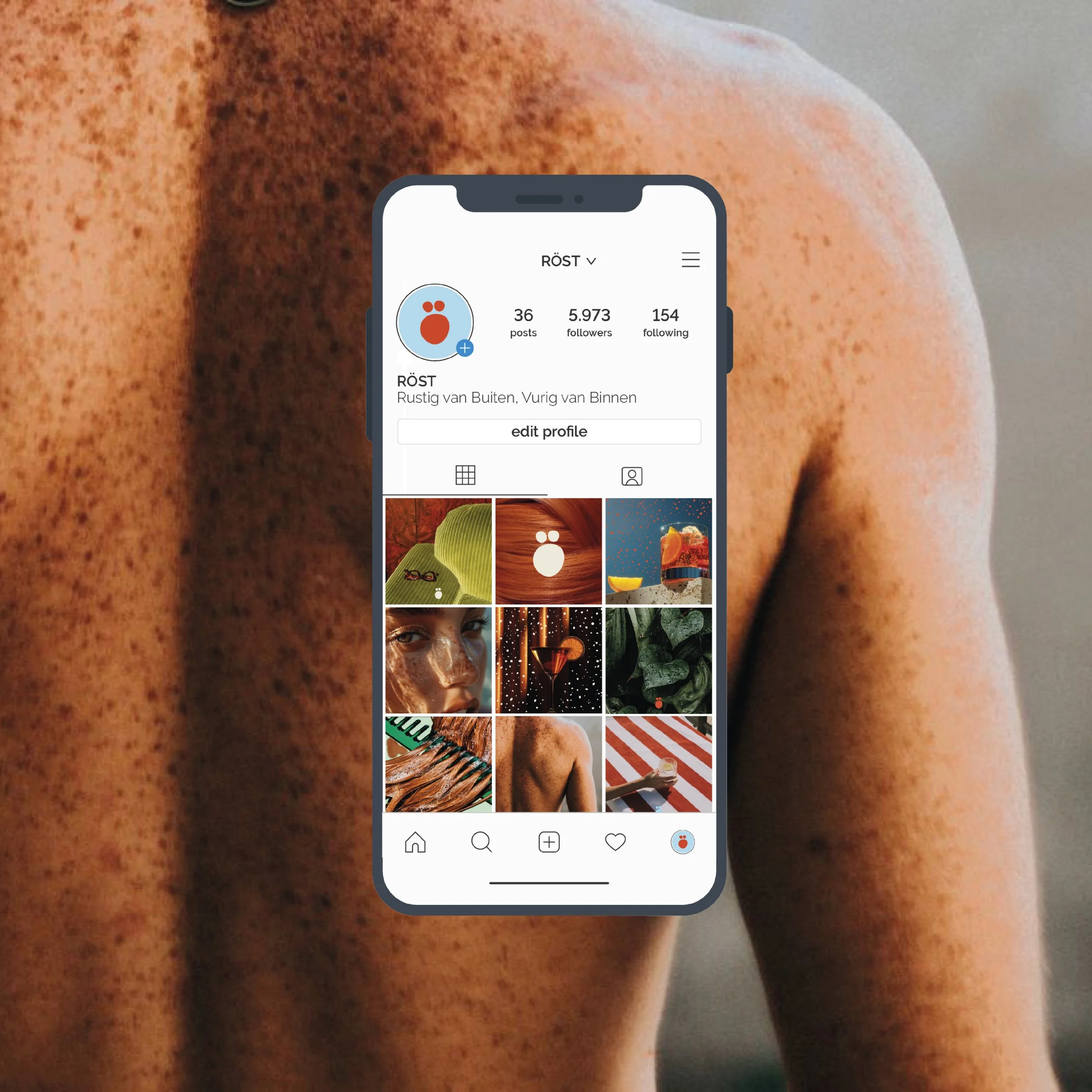
For a school branding project, we were asked to create a conceptual hotel brand targeting a specific audience. Together with Ken, we wanted to design something bold yet warm, a brand that felt both playful and purposeful. That’s how Hotel RÖST was born, a hotel especially for redheads, offering comfort, character, and protection from the sun.
Approach
We built a visual identity that celebrates individuality and warmth. Deep red tones reflect the fiery personality of the concept, while soft neutrals bring balance and calm. Subtle graphic details such as freckles add a playful twist without being overpowering. Every design choice, from the typography to the merchandise, reinforces the hotel’s charm and sense of belonging.
Result
The outcome is a branding concept that feels genuine, inclusive, and memorable. Hotel RÖST stands out as more than a visual identity. It is a story-driven concept that connects emotion with design and shows how personality can shape a brand experience.
Disclaimer: This school assignment includes background images sourced from Pinterest, used solely for educational purposes. These images are displayed here as examples and are not intended for commercial use.