Pane e Amore
THEMATIC
Brand identity and visual communication
WHAT WE DID
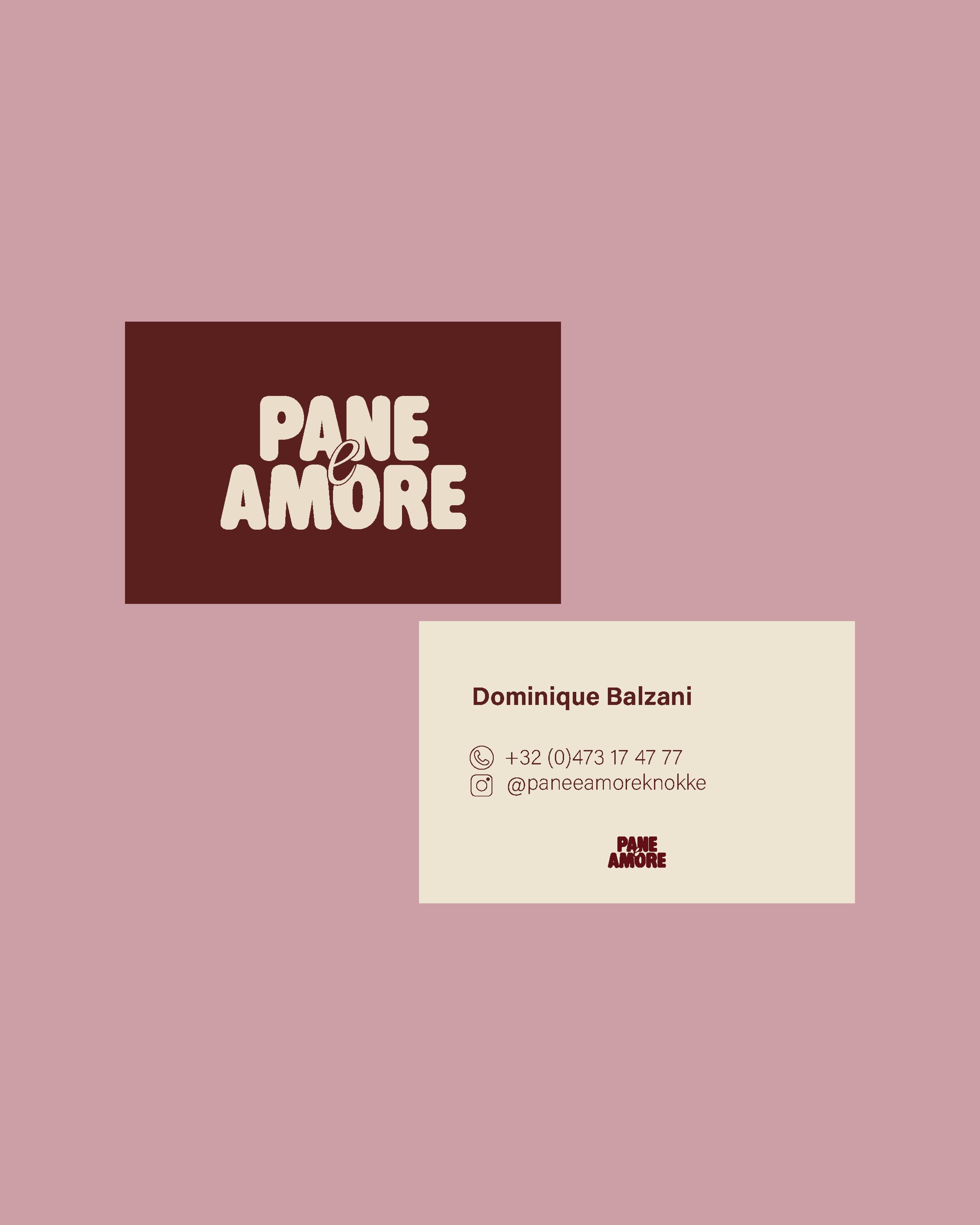
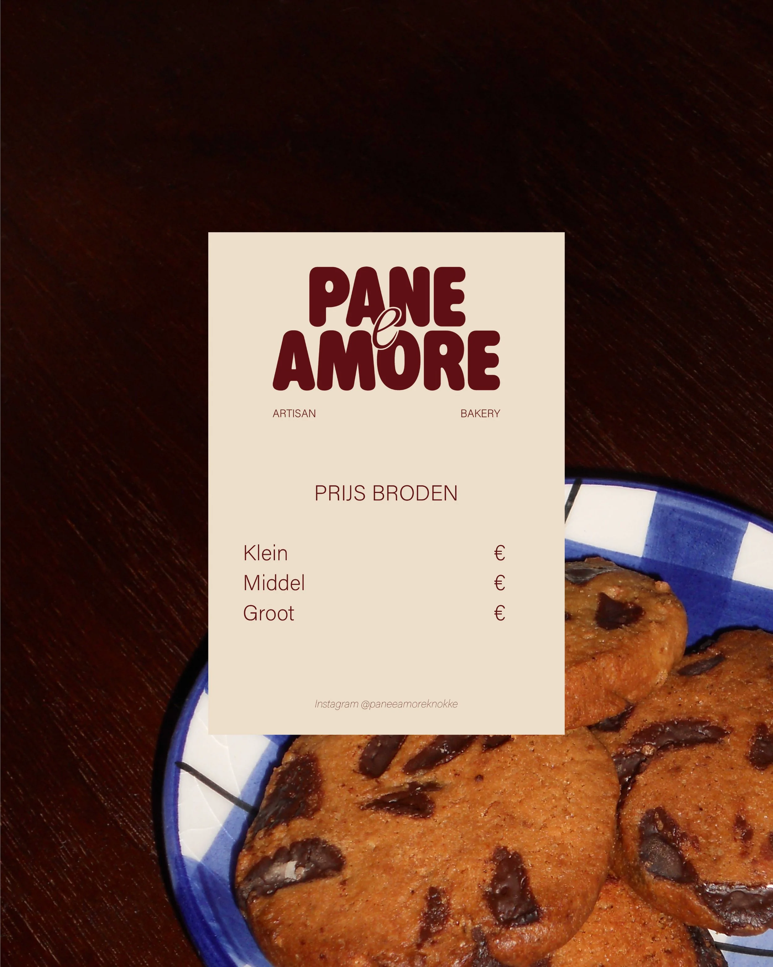
Logo design, visual language development, business card design and menu design
TEAM
Sara De Groote
-
Challenge
Pane e Amore is a small sourdough microbakery built around craft, warmth and personality. The goal was to create a playful and contemporary visual identity that reflects the spirit of the brand while standing apart from the traditional aesthetics often associated with bakeries.
Because sourdough itself is a process that requires time, care and dedication, the identity needed to capture that same sense of authenticity and passion. The name Pane e Amore, meaning bread and love, became the conceptual starting point for the design.
The challenge was to develop a logo and visual language that felt expressive, approachable and slightly unconventional, while still remaining clear and recognisable.
Approach
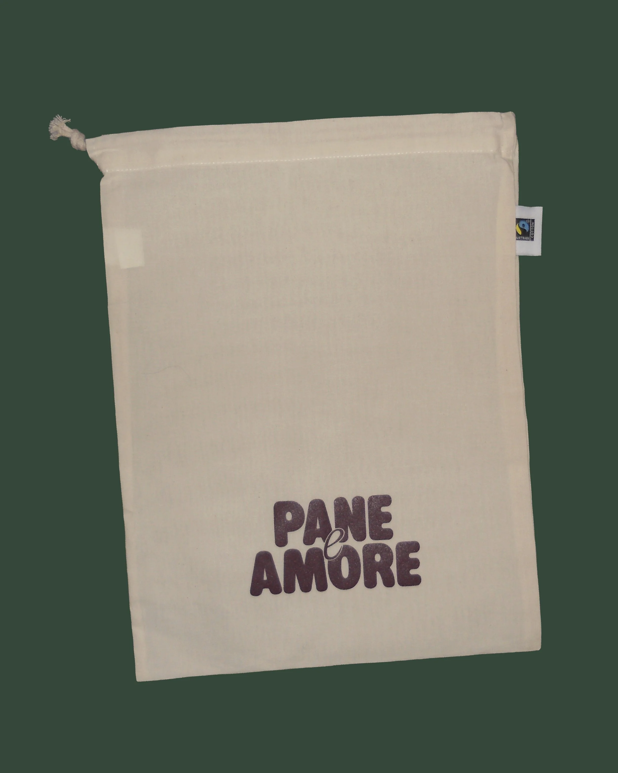
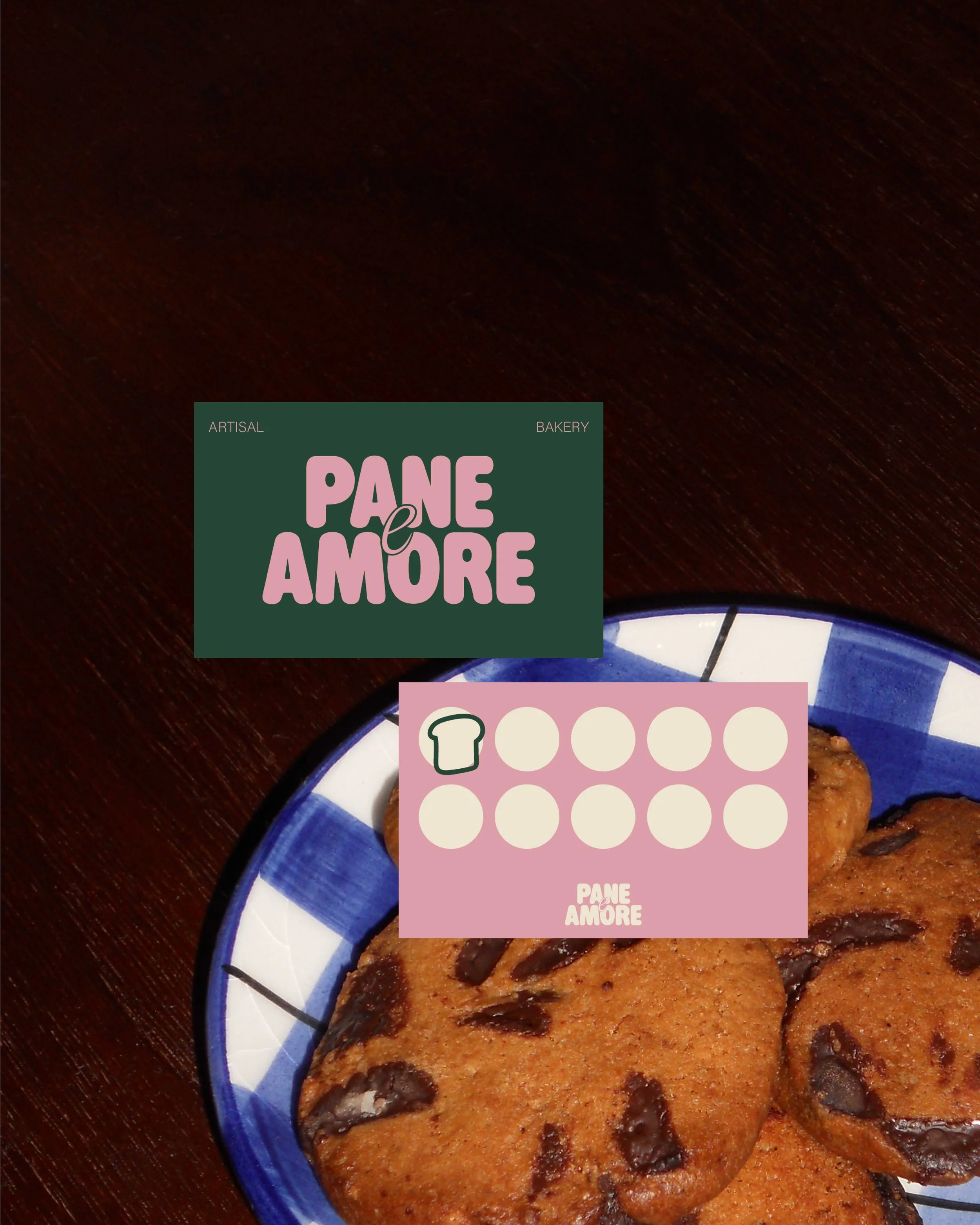
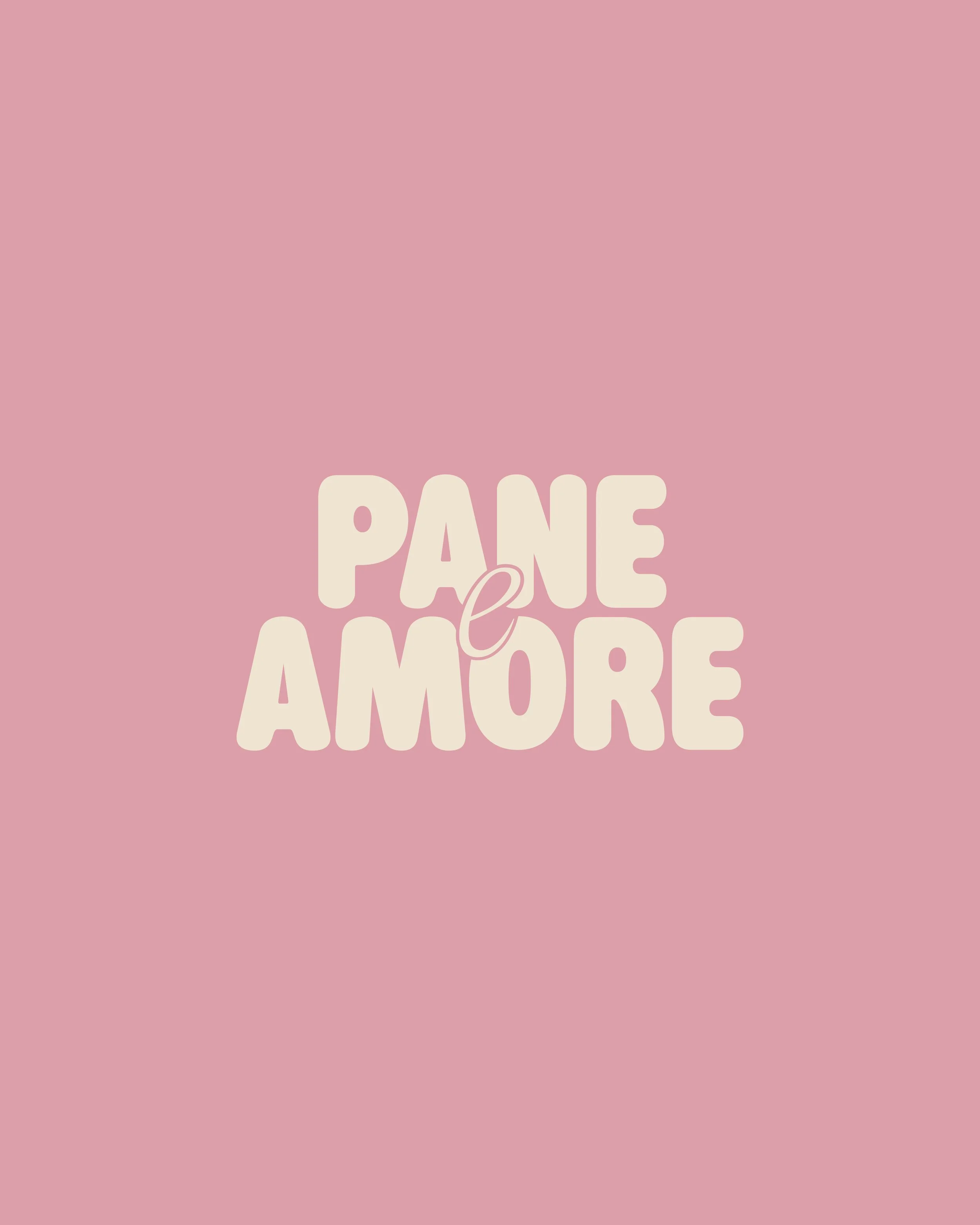
The identity was built around a playful and contemporary logo that reflects the personality of the brand. Rather than following the typical visual codes of bakeries, the design embraces a more expressive and youthful direction.
A vibrant colour palette was developed to introduce energy and warmth into the brand. These colours work together to create a fresh and inviting visual language that reflects the joy of handmade food and the love that goes into sourdough baking.
The visual elements were then applied across different brand touchpoints such as business cards and the price list, ensuring a cohesive and recognisable identity.
Result
The result is a distinctive and lively visual identity that captures the spirit of Pane e Amore.
The playful logo and colourful visual language communicate warmth, craft and personality, creating a brand that feels welcoming, memorable and full of character.
The identity reflects the philosophy behind the bakery itself: simple ingredients, made with care, passion and love.